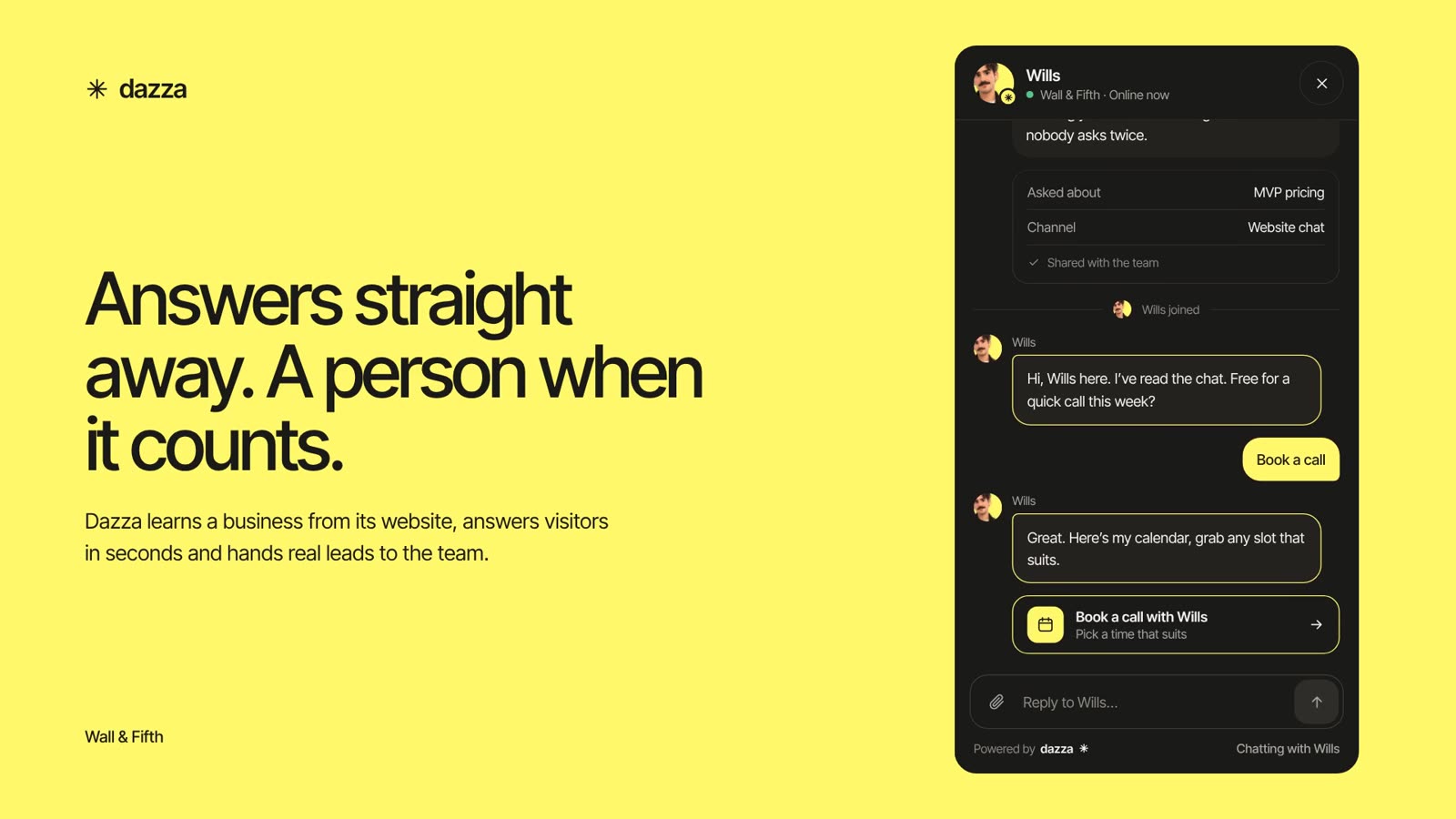
01. Make the useful thing obvious.
Lead with what gets handled. A real answer, a completed task, a clear next step. Show the product doing the work.
 OPEN BRAND STUDIOBack to Dazza
The foundations, details and little touches
that make Dazza feel like Dazza.
A clear, warm and capable identity for an AI customer service agent that gets things done.
Lead with what gets handled. A real answer, a completed task, a clear next step. Show the product doing the work.
Large, tightly set headlines. Generous white space. Quiet labels. Let scale and rhythm establish the hierarchy.
A yellow panel, an asterisk, an understated turn of phrase. Keep the product and the customer’s problem at the centre.
Explain what happens next. Distinguish an example from a live result. Make a human handover feel natural.
Use the same foundations for every page, product illustration and marketing asset.
Start with the colour and type specimens. Build a clear hierarchy before adding illustration or motion. Use the logo files below and keep the identity consistent across formats.
Use the existing Astro components and shared CSS. Download the tokens, starter and AI brief for new work. Keep the marketing website and the application’s implementation separate.
The lowercase wordmark and asterisk are Dazza’s signature. Keep them simple and give them space.
PRIMARY / INK ON WHITEACCENT / INK ON YELLOW REVERSED / WHITE ON INK
Inter Tight 700, lowercase, with the tight spacing of the site’s wordmark. The downloads use outlined lettering and the existing favicon asterisk, so no font is required to display them.
Keep at least one asterisk’s width clear on every side. For new assets, use the full wordmark at 120px wide or more; below that use the symbol. These are working rules for this guide.
Keep the proportions intact. Use a single solid colour. Do not stretch, outline, add a shadow, or replace the asterisk with an emoji. Existing website wordmarks remain unchanged.
White and ink do most of the work. Yellow gives Dazza its unmistakable warmth. Select any swatch to copy its hex code.
styles.css. White, lead text, canvas and dots are existing literal values, given descriptive names here for reuse. Integration logos retain their own brand colours.An illustration of the visual balance, not a measured quota. Avoid giving every section an accent background.
Inter Tight carries the voice. IBM Plex Mono gives structure to labels, annotations and small details.
400 body · 500 headlines · 550 buttons · 700 wordmark
400–500 · labels, numbering and technical details
| Style | Live website specification | Use |
|---|---|---|
| Homepage display | Inter Tight 500 · clamp(86px, 10.4vw, 158px) 0.96 line height · −0.043em tracking | Big brand statement. Mobile: clamp(65px, 15.7vw, 98px), line height 1.02. |
| Inner-page H1 | Inter Tight 500 · clamp(44px, 4.9vw, 74px) 0.99 line height · −0.043em | Product and solution titles. Mobile: clamp(42px, 12.4vw, 56px). |
| Section heading | Inter Tight 500 · clamp(42px, 4.6vw, 68px) 1.04 line height · −2.04px | Section introductions. Individual components have mobile overrides. |
| Homepage body | Inter Tight 400 · 19px / 1.5 | Hero supporting paragraph. Mobile: 15px / 1.6. |
| Inner-page lead | Inter Tight 400 · 18px / 1.55 | Lead text up to 470px wide. Mobile: 16.5px. |
| Button | Inter Tight 550 · 15px | Primary actions. Compact variant: 14px on desktop. |
| Label | IBM Plex Mono · 11px / 1.5 · 1.1px tracking | Uppercase section labels. Existing CSS requests 450; static files provide 400 and 500. |
Use sentence case for headlines. Keep negative tracking on display type, not paragraphs. Load the self-hosted WOFF2 files with font-display: swap.
A generous outer grid, compact product detail and clear separation between ideas.
| Foundation | Value | Application |
|---|---|---|
| Maximum content width | 1256px | Shared .section-shell. |
| Wide gutters | 56px per side | min(1256px, calc(100% - 112px)). |
| Tablet gutters | 40px per side | At 1150px and below. |
| Phone gutters | 20px per side | At 650px and below. |
| Key breakpoints | 1150 / 900 / 650px | Adjust page grids, type and navigation at their existing thresholds. |
| Hero split | 1.06fr / 0.94fr · 64px gap | Copy alongside a product illustration. Stack on smaller screens. |
| Section rhythm | 100px for shared story sections | Use the component’s own spacing. New sections usually need 64–100px, reduced for phones. |
| Text measure | 470px for inner-page leads | Keep paragraphs comfortably readable; avoid full-width body copy. |
4812162432405664100The 12-column diagram is an alignment aid for new layouts. The production CSS uses component-specific grid definitions.
Flat surfaces and fine borders keep the interface approachable without making it feel padded.
Use 1px lines in #E3E5DE to separate quiet panels and content. Where a border is needed to identify an input, use a darker outline with sufficient contrast.
Keep rounded corners proportional to the object. Reserve circles for avatars, status dots and the hero mark. Large pills are not the default shape for page content.
Existing scenes may use restrained depth for stacked UI. Avoid decorative floating cards, glossy effects and large colour gradients.
Use Dazza’s existing line icon set for navigation and product concepts.
1.6px strokes, round caps and joins, currentColor, no fill. Use the existing Icon.astro component at 18–24px. The asterisk is the brand mark, not a general interface icon.
Use an up-right arrow for a destination, a down arrow for an in-page jump and a plus for disclosure. Hide decorative icons from assistive technology; label icon-only controls.
Use SVG arrows in new assets: font fallbacks can turn less common Unicode arrows into empty squares. Integration marks come from the existing brand-logo set.
Dazza’s visual world comes from conversations, connected tools and tasks getting handled.
Use the paper or dotted canvas, simple connected nodes and real interface language. Show one task at a time. Keep text readable at its final size and label illustrative data.
Use current product screenshots and genuine business contexts. Remove customer data and credentials. Photos should support a real story; abstract robots and decorative AI brains do not explain the product.
One primary action per decision. A quieter text link gives people another way in.
| Property | Specification |
|---|---|
| Primary | Ink background, white label. 56px minimum height, 16px × 23px padding, 7px radius. |
| Hover / focus | Yellow fill slides up over 500ms. Label becomes ink; a thin ink border appears. Arrow moves 3px right and up. |
| Pressed | Scale to 0.98. No vertical lift. |
| Text link | 15px / 500, 22px gap to arrow, animated underline. |
| Navigation vs action | Use an anchor for a destination. Use a button for local state changes or form submission. |
| Disabled extension | Use a native disabled button, a readable muted label and no hover animation. Explain unavailable actions when necessary. |
<a class="button button-dark" href="https://app.dazza.io/sign-up">
  Start for free <span aria-hidden="true">↗</span>
</a>
<a class="text-link" href="#details">
  A little more about Dazza <span aria-hidden="true">↓</span>
</a>Live examples in the same visual language, with copyable starting points.
Give Dazza the knowledge to answer like one of your own.
<span class="section-label mono">
  <span class="cross" aria-hidden="true">+</span> HOW DAZZA WORKS
</span>
<h2>Your business.<br>Second nature.</h2>Use Convo.astro for production scenes. Label examples and show confirmation before consequential actions.
Yes. Set the knowledge, permissions and handover rules. Dazza works within them and brings your team in when needed.
The conversation and its context are passed to the team, so the customer does not have to start again.
<details>
  <summary>Can my team stay in control?</summary>
  <p>Set the knowledge, permissions and handover rules.</p>
</details>Status is always expressed in words. Colour supports the meaning; it does not carry it alone.
<span class="sg-status">
  <span class="status-dot" aria-hidden="true"></span> All sorted
</span>

/* Include with the shared Dazza tokens. */
.sg-status {
  display: inline-flex; align-items: center; gap: 8px;
  background: var(--yellow); border-radius: 5px;
  padding: 8px 10px; font-size: 12px; line-height: 1.2;
}A small set of form patterns for new Dazza pages. These are guide extensions, not a replacement for the application’s form system.
Visible labels above fields. At least 44px control height and 16px input text. Use a clear ink focus ring; keep placeholder text separate from the label.
Name the issue beside the field and connect it with aria-describedby. Mark invalid fields with aria-invalid. Announce the result without moving focus unexpectedly.
Keep the action’s label clear: “Saving…” or “Checking…”. Prevent repeat submissions while work is in progress. Restore the control and offer a next step if something fails.
Motion should help people follow a change, understand a connection or notice a result.
| Behaviour | Timing / easing | Use |
|---|---|---|
| Base easing | cubic-bezier(0.2, 0.7, 0.2, 1) | General transitions. |
| Expressive ease out | cubic-bezier(0.16, 1, 0.3, 1) | The shared site’s reveal and interaction easing. |
| Button fill / arrow | 500ms / 450ms | A visible response to hover and focus. |
| Section reveal | Opacity 800ms / transform 1000ms | Use restrained rises; keep content visible when JavaScript is unavailable. |
| Product sequence | A short, readable progression | Request → check → result. Stop at the result; offer replay. |
| Reduced motion | Show the finished state | Respect prefers-reduced-motion and the visitor’s pause control. |
The guide’s entrance above is a new demonstration using the existing easing. It runs only when replay is requested. Avoid endless decorative loops and scroll effects that hide useful content.
Good service starts with an interface people can read, navigate and understand.
| Colour pairing | Contrast ratio | Use |
|---|---|---|
| Aa Ink / white | 16.79:1 | Normal text passes 4.5:1 |
| Aa Ink / yellow | 15.11:1 | Normal text passes 4.5:1 |
| Aa Muted / white | 5.19:1 | Normal text passes 4.5:1 |
| Aa Lead / paper | 5.30:1 | Normal text passes 4.5:1 |
| Aa White / yellow | 1.11:1 | Decorative only · fails normal text |
| Aa Line / white | 1.27:1 | Decorative only · fails normal text |
Use one H1, a logical heading order, meaningful links, visible focus and a skip link. Keep new body copy at least 16px. Check zoom and text resizing, not just the default view.
Use labels and icons with statuses. White text does not work on Dazza yellow. The pale line colour is for decorative separation, not an input’s only identifying edge.
Use native buttons, anchors, form controls and details. Support Escape and arrow keys when building custom menus or tabs. Announce copied values and asynchronous outcomes.
Respect reduced motion. Make new standalone controls at least 44px in each dimension. Keep horizontal scrolling within intentional code or table containers.
Ratios are calculated from the hex values above. They describe these colour pairs, not a full accessibility audit of the website.
Use the existing building blocks to take someone from a question to a useful next step.
This is a composition guide. Keep only the sections that serve the page; do not force a pricing page, help article or legal page into the same long marketing layout.
Warm, assured and direct. Dazza makes a complicated task feel manageable.
“Consider it handled.”
A simple outcome. A little reassurance. No need to shout.
| Write like this | Avoid this | Reason |
|---|---|---|
| “Let Dazza check an order, move a booking or start a return.” | “Unlock the power of next-generation agentic automation.” | Name the actual task. |
| “Your agent. Your rules.” | “Fully autonomous. No oversight needed.” | Keep control and responsibility clear. |
| “I’ll pass this to the team with the details.” | “I’m a real person and I’ve personally checked everything.” | Identify the AI honestly. |
| “There’s a slot at 10am. Shall I move it?” | “All done!” before the booking changes | Distinguish an offer from a completed action. |
British English. Dazza in prose; lowercase in the wordmark. Sentence case for headings and actions. Use contractions naturally. “Help centre”, “sign in” as a verb, and “handover” as a noun.
Confirm pricing and feature availability against the live product before publishing. Label examples. Use real customer quotes with permission; do not invent ratings, results or integrations.
Carry the same type, colour, space and useful promise into every format.
AI customer service
that gets things done.
Helpful by nature.
Yours by design.
| Working format | Canvas | Composition |
|---|---|---|
| Portrait feed | 1080 × 1350 | One headline, one visual idea, logo and a short destination. |
| Square | 1080 × 1080 | A statement or a single product moment. |
| Vertical story / cover | 1080 × 1920 | Keep the key message central and allow room for platform controls. |
| Landscape / link | 1200 × 630 | Short headline beside a simple illustration; make small-scale text readable. |
| Presentation | 1920 × 1080 / 16:9 | One argument per slide. Large type and one supporting visual. |
| Email image | 1200 × 600, displayed at 600px | Retain live text and the real button in the email body. |
| A4 / 210 × 297mm | Use vector logos. Confirm bleed, colour profile and final dimensions with the printer. |
These are reusable design canvases, not platform upload specifications. Check the destination’s current crop and safe-area requirements before a campaign.
Dazza’s marketing site is an Astro static site. Reuse its components instead of recreating the design on every page.
| Source | Responsibility |
|---|---|
public/styles.css | Fonts, core tokens, homepage components, shared buttons and motion. |
public/site.css | Navigation, footer and inner-page components. |
src/layouts/Base.astro | Shared shell, metadata, fonts, header, footer and scripts. |
src/components/ | PageHero, Story, Features, Split, Details, Tiles, Steps, Cycle, Statement, Faq, Related, Closing, Icon and Canvas. |
src/data/seo.ts | Page titles, descriptions and source-file mapping. |
public/site.js | Shared interaction and motion. Homepage-specific behaviour lives in app.js. |
---
import Base from "../layouts/Base.astro";
import Closing from "../components/Closing.astro";
---
<Base title="Page title — Dazza" description="A useful description.">
  <section class="section-shell">
    <h1>A clear, useful promise.</h1>
    <p>Explain what Dazza helps the customer do.</p>
  </section>
  <Closing />
</Base>PageHero or the relevant component with its required props. Scope page-specific CSS; keep existing global styles intact.Keep content and navigation usable without JavaScript. Do not put a whole page behind animation readiness. Use semantic HTML before adding custom interaction.
When a shared token or component changes, update the corresponding guide specimen and working files in the same change. The tokens download is a documented snapshot, not the production CSS dependency.
Use this checklist for each new page or asset. Your checks stay in this browser only.
A working set for the next page, pitch or campaign. Version 1.0 · November 2026.
Logos, tokens, CSS, fonts, starter layouts and the AI brief.
Dazza-Working-Files.zipExact values, roles and source notes.
tokens.jsonPortable brand variables and font declarations.
dazza-tokens.cssA responsive hero, section, FAQ and closing invitation.
dazza-page-starter.htmlEditable portrait, square and landscape HTML canvases.
dazza-social-starter.htmlA compact reference for consistent design and copy.
Dazza-AI-Brief.mdOutlined vector; transparent background.
dazza-logo-ink.svgOutlined vector for ink backgrounds.
dazza-logo-white.svgThe existing mark geometry, isolated for reuse.
dazza-symbol.svgFonts are included with their SIL Open Font License files. Logo outlines are prepared from Inter Tight and the existing Dazza mark. The starter layouts are editable HTML; they are not Figma or Slides files.